Why Are Main Menus at the Top of the Page?
21 Designs Australia
In this article, we will explain what main menus consist of and why they are usually located at the top of the web page. We will also share some tips for designing a horizontal main menu so you can maximise its benefits.
What Do Main Menus Consist Of?
A simple website main menu (which is also called a navigation menu or navigation bar) may have five to seven items. These typically include About Us, Products, Services, Contact, and FAQs. Within these main menu items, you may also find sub-menu items that are typically displayed in a drop-down fashion.
For example, the “Products” main menu item may include a sub-menu for each product category (e.g., Men, Women, or Kids). The user simply has to click or bring their cursor over the main menu item to reveal the hidden sub-menu options.
In a nutshell, the main menu or navigation menu is where users find the links to your site’s most important pages or sections. An effective main menu is crucial to the success of your website as well as to the satisfaction of your users.
Read more: What is Usability in Web Design?
Five Reasons Why Main Menus are at the Top of Web Pages
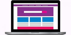
Main menus come in two types: horizontal and vertical/left menu. Of the two, the horizontal type is more commonly used because of its high visibility as well as its enhanced usability. A properly designed horizontal main menu can positively affect your traffic and conversions.
The truth is, the majority of website visitors expect to find the main menus across the top part of any website. Thus, putting it in this standard position and orientation (i.e., horizontal) can make your website easier to use, especially for beginner-level users. Aside from this, most main menus are intentionally placed at the top of web pages because:
- They fulfil user expectations. Your website visitors are already accustomed to reading from left to right. Putting your horizontal main menu at the top of your page will give them what they expect and thus, make it easier for them to navigate through your website. A radical menu placement that they may have never seen before may just confuse them.
- They offer a faster way for users to find what they are searching for. Main menus placed at the top of the page are more visible than their left/vertical counterparts because they are always above the fold, meaning, they are placed just below the logo and header and right above the main content of the web page, both of which are visually dominant interface elements. When a user lands on a website or any webpage with a main menu at the top, they can quickly see which menu item to click right off the bat.
- They don’t take up a lot of space. A horizontal main menu only occupies a sliver of space on your webpage. With this type of menu, you will never have to worry about running out of space for the rest of your content. This type of menu placement leaves you with enough space to display large text and images, as well as interactive elements and creative layouts without making your web pages look and feel crowded.
- They allow for more attention-grabbing visuals. A major trend in web design is to fill the whole screen with text and graphic elements, also known as the full bleed layout. This can be an effective way to incorporate high-quality images, videos, or animations into your web page. And you can make better use of larger screens with a horizontal navigation bar as it allows you to take up the entire row for your menu items.
- They effectively direct users to information that matters most. This specifically applies to niche sites, where the content is geared towards an audience with a specific set of interests, such as handicraft, consulting, parenting, and tutorials. Since the audience’s field of interest is very specific, every menu item can be considered a high priority. Thus, the ability to scan multiple items hidden in drop-down menus, which the left/vertical main menu provides, is not exactly needed here. What you need is a navigation bar that lets people spot high priority menu items right away. This is why a top menu makes more sense in this context, as it allows users to find the content they’re looking for faster.
Tips for Creating Your Horizontal Main Menu
- Include clear and descriptive menu labels. Avoid generic labels such as “Services” and “Products” that don’t tell users and search engine sites about what you exactly offer. It’s best to incorporate descriptive words or even key phrases in your main menu to clearly communicate your message so that people will know they’re in the right place.
- Keep your number of menu items at a minimum. Seven is an ideal number to work with: users who have short-term memory can only remember up to seven items. You don’t want to overwhelm your users with hundreds of links to click on when they see your main menu. What you want is to make it easy for them to locate the page they want to visit. Limiting your menu from five to seven items will help improve its usability and user-friendly score.
- Arrange your sub-menu items according to priority. When creating the sub-menu for your main menu item (i.e., products section), put the items that are most important to your users at the top of the list, as this is where user attention and retention are at its highest.
- Optimise your site’s navigation. Take advantage of your site’s analytics to understand how your visitors use the main menu. Find out which items are working and not working, then make the necessary adjustments to deliver a better user experience.
For Improved Usability
Majority of main menus are placed at the top of the page because this position helps fulfil user expectations, offers users a faster way to explore your site, conserves vertical space, allows you to maximise your page’s width, and directs users’ attention to the most important items straight away.
All these benefits result in improved usability and better user experience, which are instrumental to the success of any website.