How are Colours Used in Web Design?
21 Designs Australia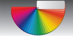
Choosing colours for your website can be challenging, especially for those with limited knowledge about colours or poor colour coordination skills. To aid you in your colour selection and colour combination process, we’ve prepared this article to help you better understand colours and how they are used in web design.
Studies have shown that 85% of customers cite colour as one of the factors that influence them to buy a particular product, with colour impression accounting for 60% to 90% of snap judgments customers make about your product. That’s a pretty high figure that you wouldn’t want to leave to chance. This is why you need to make sure that your web designer puts in a lot of thought into your website’s colour scheme so it will leave your visitors with a positive impression of your brand and encourage them to keep coming back for more.
Here are some basic principles about colours that are worth knowing for your web design project:
Colour Wheel
The colour wheel is a tool that helps designers see the relationships between the three main colour categories, which are primary, secondary, and tertiary.
The primary colours are red, blue, and yellow. Combining any two of these colours will result in secondary colours, which include purple/violet, orange, and green. Primary colours cannot be formed by mixing any other colours together.
Tertiary colours can be created by combining a primary colour and a secondary colour. Designers can choose from six tertiary colours, including red-violet, blue-violet, yellow-orange, red-orange, yellow-green and blue-green.
Colour Harmonies
Your website’s colour scheme can be made up of complementary colours or analogous colours.
Complementary colours are contrasting colours that work perfectly well together. To create a scheme with complementary colours, choose the colours that are placed on the exact opposite side of the colour wheel. Examples of complementary colours are violet and yellow, blue and orange, and red and green.
When utilised at 100% saturation, complementary colours add a vibrant look to any website. This works well especially if you want certain parts of your website to stand out.
Conversely, analogous colours are the three colours that sit next to each other on the colour wheel. These colours create a pleasant, comfortable and calming effect to viewers. They naturally match even though they offer little contrast. If you want to add contrast to your analogous colour scheme, choose one primary colour and add a secondary colour. You may also use black or white as an accent.
Colour Systems
In web design, there are two kinds of colour systems: RGB (Red Green Blue) and CMYK (Cyan Magenta Yellow Key).
RGB is typically used in all kinds of screens while CMYK is commonly utilised in print. Since your website visitors use computers and mobile devices, we recommend using the RGB colour system for your web design projects.
Colour Groups
Colour groups can be divided into three categories: warm, cool, and neutral.
Warm colours like red, orange and yellow elicit passion and excitement. They can evoke intense feelings of anger and demand a high level of attention.This explains why red is often used in protests, warning signs or error messages.
Cool colours are commonly made up of blue, green and violet. They make people think of cold weather, crystal blue waters, ice, or night. These colours can evoke a sense of melancholy, or create a soothing and relaxing effect.
Lastly, neutral colours don’t evoke as much emotion as warm and cool colours. These include gray, taupe, ivory, beige, and brown. Neutral colours are often used as a background or an accent for vibrant colours.
Psychology of Popular Colours in Web Design
Colours can be interpreted positively and negatively by your web visitors. The type of interpretation they make depends on their personal views about colours and how your colour schemes are used.
Below is a list of popular colours and their corresponding meanings. Many web designers refer to these when they design websites.
- Red – Often associated with passion, power and dominance, red can influence visitors to make a snap decision, or at the very least, grab their attention. A study showed that a red action button with white inscription may help increase a website’s conversion rate by 34%.
- Orange – The product of red and yellow, orange creates a feeling of joy and cheerfulness. It can also amp up mental activity, which is why some web designers use it to trigger feelings of anxiety to attract impulsive online shoppers.
- Yellow – The colour of happiness that can hold the attention of your website visitors, yellow is used to highlight a brand’s positive qualities. It also evokes optimism, confidence, and intelligence.
- Green – This colour symbolises the healing powers of nature, tranquility, and power. This is why green is commonly used in websites that address environmental issues. In marketing, green helps stimulate balance and harmony in a customer’s brain, which can encourage them to make up their mind about a product or service.
- Blue – Blue symbolises professionalism and trust. If you want to be viewed as an authority or trustworthy figure in your industry by your target audience, use blue for your website.
- Purple (Indigo) – A mix of red and blue, purple symbolises wealth, spirituality, creativity and mysticism. It is also the colour of royalty and sophistication, which is why it’s commonly used by luxury brands.
- Black – A neutral colour, black implies empowerment, sophistication and elegance. It is also a good background colour for digital assets that are more noticeable on a dark backdrop than on a white backdrop.
- White – White is known for drawing out positive and peaceful emotions. It is also associated with cleanliness, newness, minimalism, elegance, and innocence. Whitespace, when effectively used, can direct the attention of your visitors towards the more important parts of your website.
3 Tips for Using Colours in Web Design
Follow these three tips to increase your chances of having an effective website.
1. Pick a colour scheme with your target audience in mind.
Ask yourself these questions: Will your colours evoke the emotions your target audience should feel about your product? Are the colours appropriate for the kind of “personality” your brand and target audience have?
When it comes to selecting colours for your website, your customer’s views about the colours should carry more weight than the colours themselves. Choosing a colour just because it is your favourite colour or it is currently popular is not advisable, and may not give you the results you are looking for. Being strategic and scientific about your colour choices will go a long way in attracting, retaining and converting your website visitors.
2. Use a different colour for your site’s interactive elements.
If you only use one colour for the rest of your web page, visitors may find your website, and to a certain extent, your brand, uninteresting. Using just one colour will also make it more difficult for your visitors to understand which content they should pay more attention to.
Traditionally, designers only use one or two colours on their website. But it takes an advanced level of knowledge and skill to use a limited number of colours and maintain the interest of your visitors. For this reason, we recommend using a different colour to accentuate or emphasise the most important interactive elements of your site, such as action buttons or links.
3. Check contrast and readability.
Prioritise your content readability over aesthetics to enhance your visitors’ user experience. Your web design will fail if your visitors cannot even read the text on your website.
Check the colour contrast between the text’s colour and background colour. If you experience discomfort while reading a text in yellow colour against a red background, test another colour combination. The rule of thumb is to use a black font colour against a white background or vice versa. Choosing either the dark-on-light or light-on-dark colour scheme for your textual web content is proven to generate high readability scores than dark-on-dark or light-on-light colour schemes.
Choose your colours well
As one of the most important elements of web design, colours should be carefully considered and chosen when you are building your website. Using a colour scheme that your target audience feels good about will most likely result in a positive connection and successfully convey your intended message.