How Does a Responsive Web Design Work?
21 Designs Australia
If you’ve visited websites that easily adapt their design and layout to fit different screen sizes, the questions, “How does it do that? How does responsive web design work?” must have already crossed your mind. In this post, we’ll answer these questions by learning some of the principles of responsive web design.
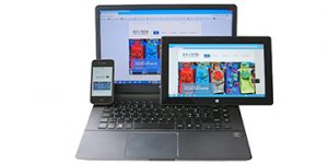
Responsive web design provides users with an optimal browsing experience, with no exceptions. Regardless of whether your visitors are using a desktop or laptop computer, tablet or smartphone, a responsive website adjusts automatically to their device’s screen size without compromising its aesthetics or performance.
Smartphones, tablets, laptops and desktops come in different screen sizes. If your website fails to display properly on the device of your visitors, they will most likely leave your website, resulting in a lost opportunity for you to engage with them. If you don’t want to miss your opportunity to reach more than 5 billion mobile internet users, having a responsive website should be one of your top priorities.
These four principles will help us understand how responsive web design works.
Principles of Responsive Web Design
Fluid Grid System
As the name suggests, a fluid grid system enables your web content to be “fluid” so it can flow smoothly into its container, which refers to the screen size of your users’ device. It doesn’t matter what the screen size or type of device your visitors are using because this system makes sure your content will appear in the proper size and proportion.
To better understand how fluid grids work, we need to learn how websites were designed before the advent of responsive web design.
Websites were traditionally defined according to their pixel size and designed using the 960-pixel system. When smartphones and tablets came around, the focus shifted to adaptive designs. This type of design involved the use of specific pixel sizes for specific screen sizes. Both older forms of web design were pixel-based, which required the use of absolute measurements.
Fluid or responsive designs are neither pixel-based nor do they use absolute measurements. Instead, fluid designs are percentage-based and use the concept of relative proportionality. Designers using the fluid grid system specify first the maximum layout size for the web design, then follow a formula to compute the percentage measurement of the elements, before including these percentages in their CSS script. Ultimately, these percentages will be the basis for the width and height adjustments of the different elements of your web design.
Fluid Image
Unique to responsive websites, a fluid image is an image stack that enables your images to scale properly according to the screen size of the device used by your visitors. To ensure your images are fluid, use the following CSS command:
img { max-width: 100%;}
This formula commands the browser to not only scale according to the screen size of the device but also to display your images at 100% of their pixel value. This directive is very important on two accounts: first, it allows your images to expand or minimise accordingly, rather than just sit on your site with fixed dimensions, and second, it stops your images from stretching or shrinking improper proportions, which usually happens when the screen size is much larger or smaller than the images. It also helps retain the proper aspect ratio of your images.
For best results, we recommend the use of SVG files as this type of image file is extremely scalable.
Media Queries
Media queries are a cornerstone of responsive design because they are responsible for changing your layout according to specific conditions. They are the reason why some websites show four columns of content on a laptop but only one column on a smartphone. This CSS feature is used by designers to indicate when your design elements should be altered, usually according to the screen real estate of the device used by your users. Media queries can then be viewed as filters for multiple devices and screen sizes.
A simple example of a CSS media query is:
@media screen and (max-width: 992px)
{
header { height: 70px; }
article { font-size: 14px; }
img { max-width: 480px; }
}
This media query will hold true for browser windows that measure a maximum of 992 pixels wide or less. All the values you assigned for your specific elements – height of 70 pixels for your header, 14 pixels for your font size and a maximum of 480 pixels wide for your image – will only be realised if the screen resolution of your visitors’ devices are 992 pixels or less.
Breakpoints
Breakpoints refer to predetermined points that signify a change in your web design layout, such as having your web design display five columns on a tablet, but only one column on a smartphone, for example. Media queries are used to specify your breakpoints.
There are no hard and fast rules about where you should put breakpoints because your content plays a role regarding their location (for example, you may need to put a breakpoint where a paragraph breaks).
For the best results, we recommend designing for the smallest resolution size available, or mobile-first. This will help you identify the most valuable web content that your visitors should see on a small screen real estate. In the process of expanding your view, you’ll see where your design starts to look troublesome. That will point to where you should place your breakpoint. Knowing the screen resolution of commonly used devices (e.g., iPads) may also help you identify the most appropriate spot for your breakpoints.
These are just four of several principles that guide web designers in creating responsive websites. As mobile technology develops and your user’s needs continue to increase, the demand to deliver superior user experience continues to grow. A responsive website is one of the most effective ways to ensure your visitors’ needs and expectations are met.
Read more: What is User Experience in Web Design?
Respond Responsibly to Your Visitors
Responsive design gives your website the ability to adjust according to your visitors’ device and corresponding screen size. If you want to leave your visitors with a positive first impression of your brand, engage more of your passive browsers and convert them into customers, it’s time to make that switch to a responsive website!
We hope this post was able to enlighten you about two things: first, what responsive web design is, and second, how does a responsive web design work. Feel free to explore our website and read our other blog posts about web design and development.
We ensure all our web designs are responsive. Call us to speak with Brisbane’s best website design agency.